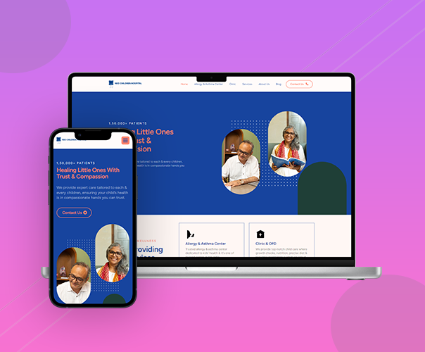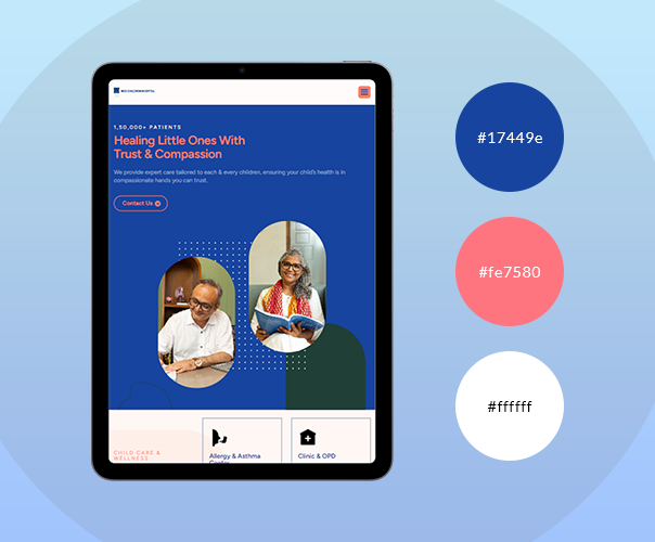

Neo Children Hospital
At the heart of our process was a clear understanding of the doctor's requirements, ensuring we were all on the same page before sketching the first layout. With creativity flowing, we explored multiple design options, each tailored to capture the essence of the medical practice while engaging patients effectively.
Incorporating feedback is key in our world, so we reshaped our designs based on the doctor’s insights, turning good ideas into great ones. Our team thrives on collaboration, and the back-and-forth exchange made the designs even sharper.
But we didn’t stop at aesthetics; we dove into data-driven research, combining analytics with psychological principles to create a design that speaks to the heart and mind. We believe that a visually appealing layout paired with strategic insights is the perfect prescription for success.
The result? A visually stunning, user-friendly design that not only meets the doctor's needs but also enhances patient experience. After all, in the world of healthcare, a well-designed approach can be just as important as a well-prescribed treatment!
- Date 18 Aug 2024
- Category Website
- services User Experience, Web Design, Web Development, Content Writing, SEO
- Credit Adons' IT Team
