Scroll down for project info.
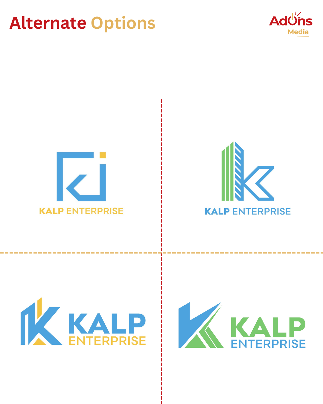
Kalp Enterprise, a company engaged in trading construction materials and providing construction labor, wanted a logo that communicates strength, reliability, and progress. Their vision was to build an identity that reflects their role as a backbone of the construction industry while staying modern and professional.
The final logo integrates the bold letter “K” with architectural elements, symbolizing construction and growth. The clean blue tones highlight trust, dependability, and a strong foundation for the brand.
The challenge was to represent two different aspects—materials and manpower—within one cohesive logo while ensuring it remains simple, versatile, and instantly recognizable.
Our solution was to fuse the letter “K” with building silhouettes, creating a direct visual link to construction. The geometric balance ensures the identity works across signage, documents, and digital platforms.
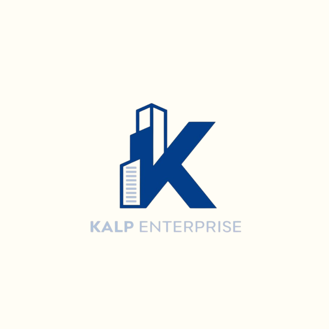
We explored architectural forms to merge them seamlessly into the initial “K,” representing both identity and industry. The upward structure conveys growth, while the bold form ensures authority and impact. The blue palette was chosen to symbolize trust, dependability, and stability—qualities central to Kalp Enterprise’s business ethos.