Scroll down for project info.
The client, a financial services firm, approached us to create a professional yet modern logo that communicates trust, growth, and stability. They wanted an identity versatile enough to represent their services—loans, mutual funds, and insurance—while appealing to both corporate and retail clients.
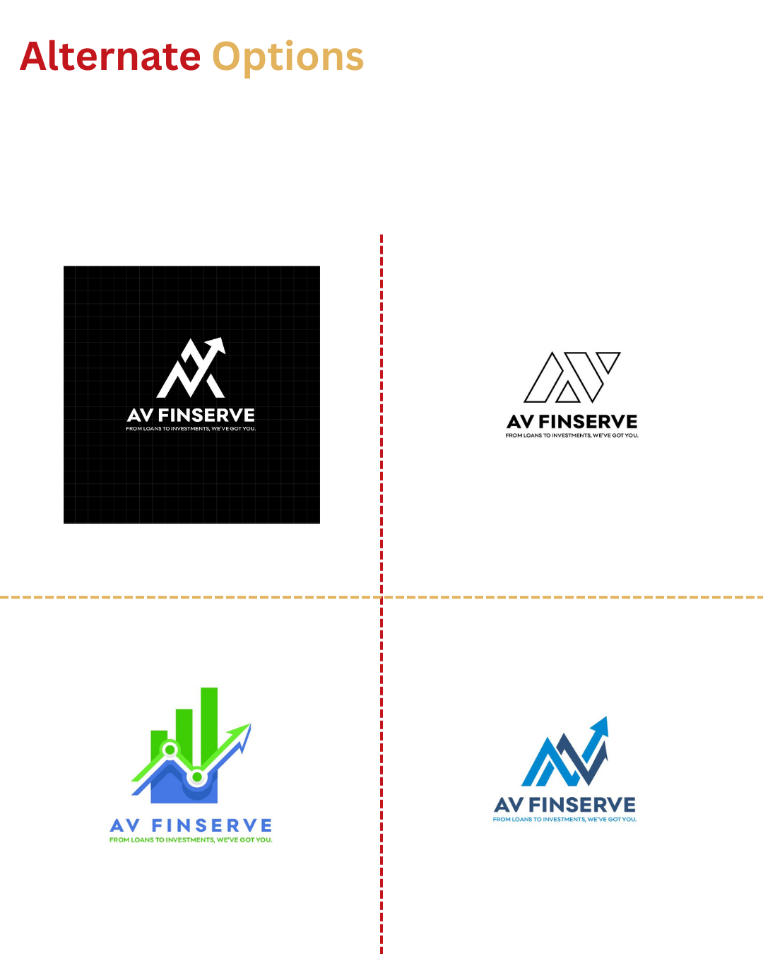
The final logo combines strong typography with a rising arrow mark, symbolizing financial growth and stability. Shades of blue convey trust, reliability, and confidence, aligning with the brand’s vision.
The challenge lay in representing diverse financial services—loans, mutual funds, and insurance—within a single, cohesive identity, while maintaining a balance between corporate seriousness and approachability.
We solved this by designing a rising arrow monogram that reflects progress and upward momentum. The modern design language ensures versatility across digital, print, and corporate collaterals.
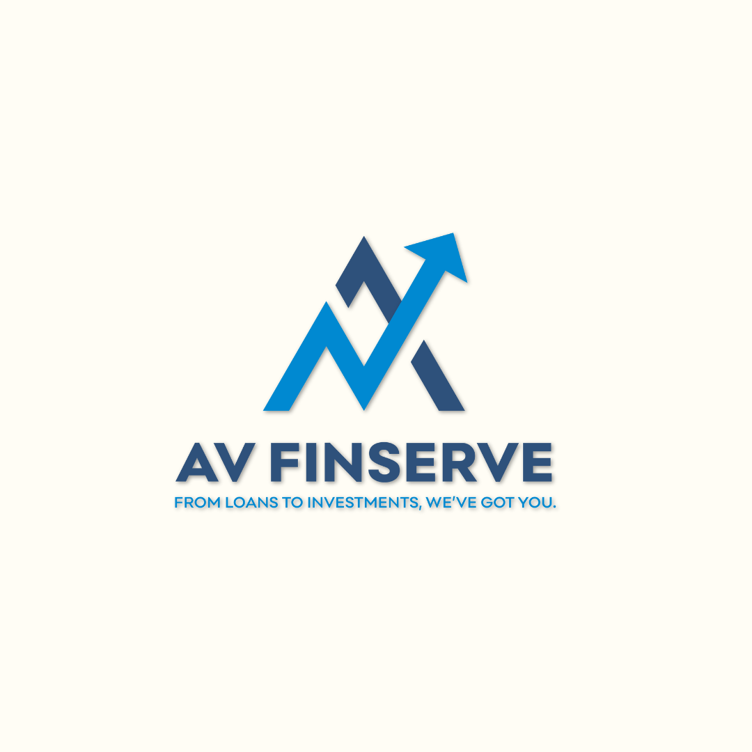
We began by exploring concepts around finance, growth, and security. The arrow was chosen as a universal symbol of progress, subtly embedded within the initials to create a strong identity. The blue palette ensures trust and professionalism, while the geometric structure reinforces stability and long-term vision.