Scroll down for project info.
The client, a legal firm specializing in documentation and advisory services, sought a professional identity that would establish credibility and authority. Their requirement was clear—their family name Raval had to remain central, symbolizing trust, reliability, and long-standing legal expertise.
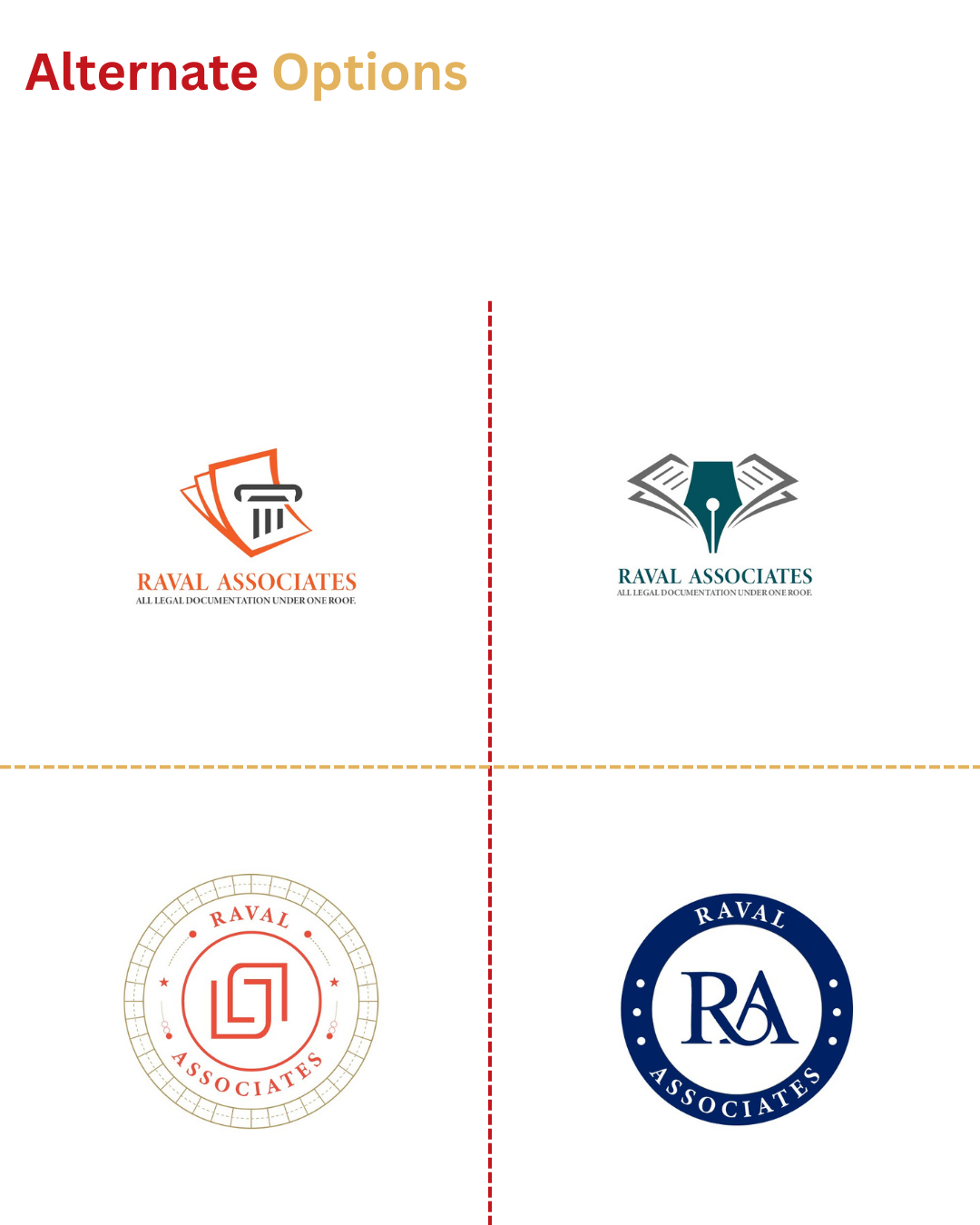
The final logo balances tradition and professionalism with a classic circular emblem. The bold typeface emphasizes the Raval name, while the surrounding stars reflect integrity, excellence, and credibility.
The challenge was to create a design that positioned the firm as professional and trustworthy without making it appear too corporate or impersonal. The identity needed to feel both approachable and authoritative.
Our solution was to design a clean circular crest, a timeless form that conveys stability and recognition. The addition of stars strengthens the sense of trust, while the serif typography reinforces tradition and legal expertise.
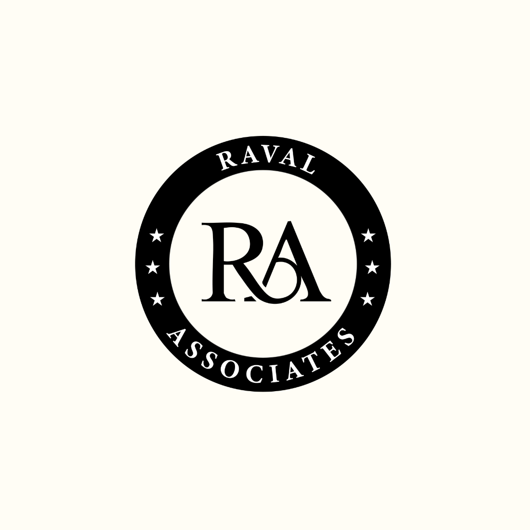
We began by exploring symbolic elements that reflect authority and reliability. The circle was chosen to represent wholeness and continuity, key values in legal practice. Stars were added to signify guidance and excellence. Anchoring the family name in a bold serif typeface ensures recognition, legacy, and timeless professionalism.